Skip to content
Wrong color temperature can make great products look dull or distort your brand’s visual tone.
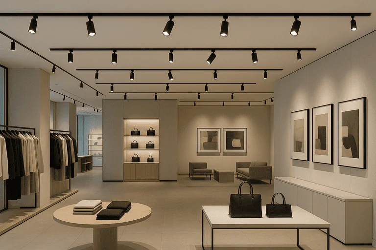
For track lighting in commercial spaces, choose a base color temperature like 3500K–4000K, then use slightly warmer or cooler tones for highlights. This layered approach enhances visual contrast and product appeal.
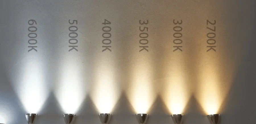
Color temperature isn’t just a visual effect—it shapes how people feel and what they notice. In my 20 years working with retail, office, and gallery clients, choosing the right color temperature often made the biggest impact on the space’s final feel.
What is color temperature1 and why does it matter in lighting?
Color temperature (CCT2) is measured in Kelvin (K). It defines how “warm” or “cool” a light feels—affecting atmosphere, focus, and even product color accuracy.
In track lighting, CCT2 matters more because the beams are narrow and often directed at eye level. A mismatch can distort materials and ruin ambiance.
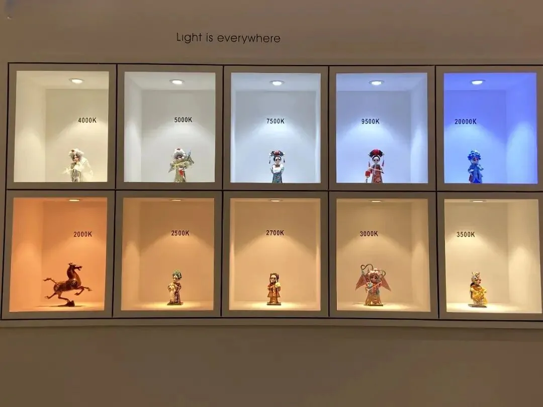
Here’s a quick breakdown:
| CCT2 Range | Common Kelvin | Feel / Mood | Ideal For |
|---|---|---|---|
| Warm White | 2700K–3000K | Cozy, soft | Lounges, warm-tone stores, casual dining |
| Neutral White | 3500K–4000K | Clean, natural | Retail general lighting, showrooms, offices |
| Cool White | 4500K–5000K | Crisp, modern | Electronics, galleries, glass and metal displays |
I never treat color temperature1 as an afterthought. It needs to match the brand vibe, product material, and space usage—otherwise, even a premium lighting setup can feel off.
Is 3000K or 4000K better for living rooms?
For homes, 3000K3 gives a warmer, more relaxed feeling. But in commercial spaces—even cozy ones—I usually recommend going slightly cooler for clarity and balance.
3000K3 is warmer and softer, ideal for residential or boutique chill zones. 4000K4 gives a neutral, cleaner look—better for retail, galleries, or modern office areas.
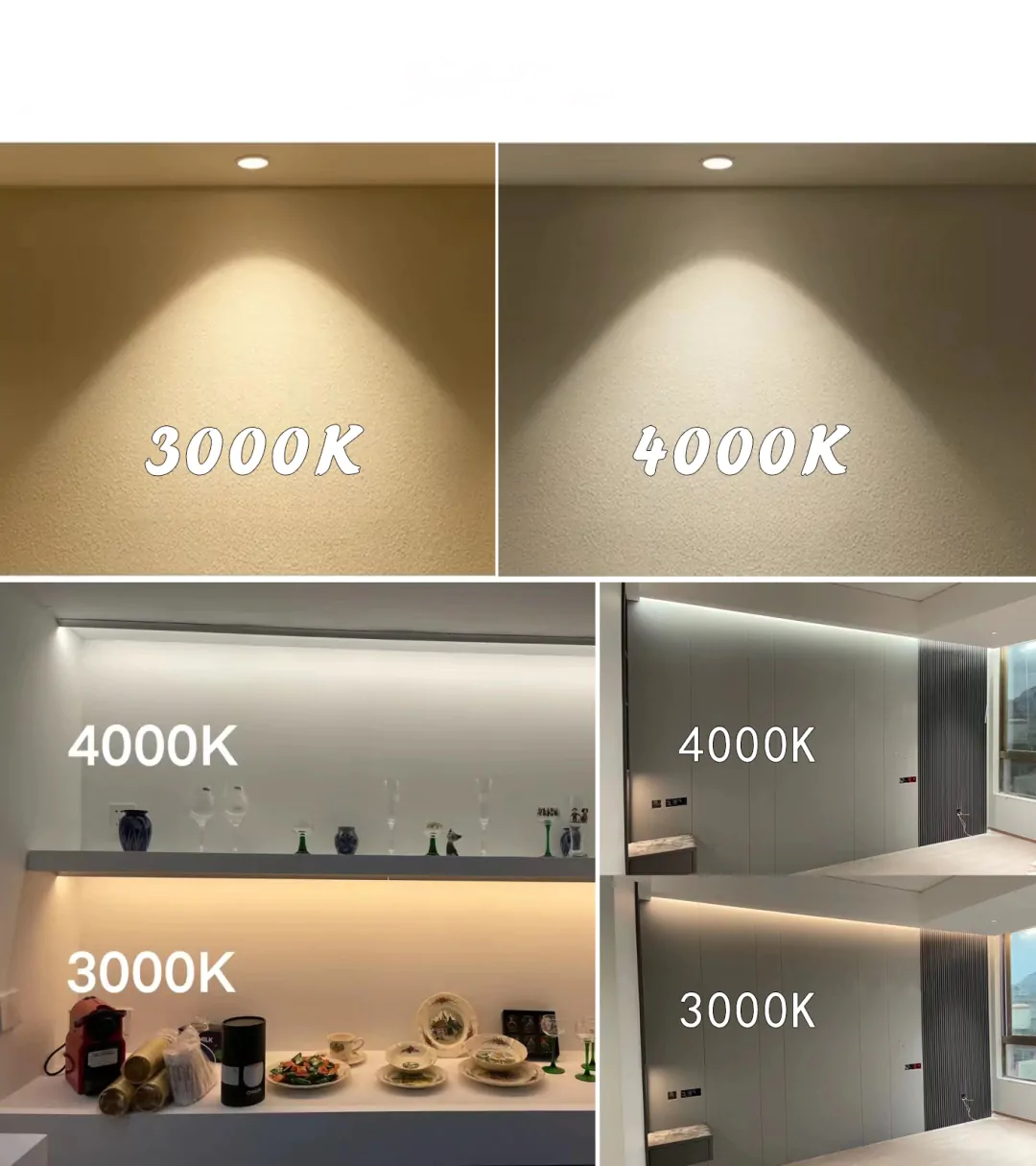
In retail, I often combine both: set the ambient base around 3500K–4000K4, then add 3000K3 in seating areas or to soften specific zones. What matters most is keeping transitions smooth—jumps in color temp between fixtures can look jarring.
How do color temperature5s affect mood and productivity?
Color temperature affects emotional tone and functional comfort. Warmer light promotes relaxation. Cooler light sharpens focus and attention.
Warmer temps (2700K–3000K) calm people, while neutral-to-cool tones (3500K–5000K) boost alertness, clarity, and engagement—essential in workspaces and showrooms.
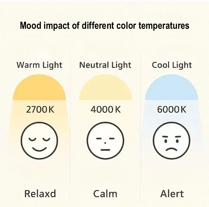
In offices, I’ve seen that moving from 3000K to 4000K improves task clarity and reduces eye fatigue. In retail, cooler tones help emphasize clean lines and sharp product features—especially with glass, metal, or modern finishes.
The key is balance. Overuse of cool light can make spaces feel sterile. Too warm, and things feel unfocused or dull. Use warm light for accents and cool light to command attention.
What color temperature6 is best for art galleries or retail displays?
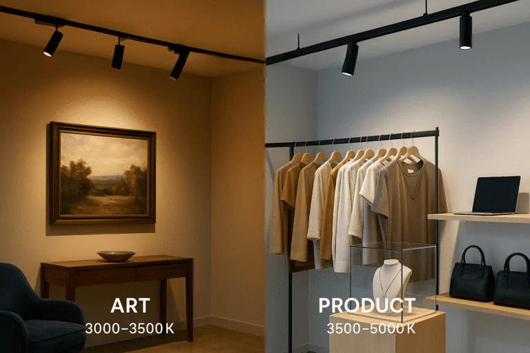
For display lighting, use higher CRI (90+) and slightly cooler color temps to enhance clarity and color rendering.
3500K to 4000K is ideal for retail and galleries—cool enough to sharpen details, warm enough to maintain natural tones. For metallics and glass, go up to 4500K for added brilliance.
What I recommend:
- Jewelry / glass: 4000K–4500K (cooler light sharpens contrast)
- Wood, leather, warm textiles: 3000K–3500K (warmer light enhances richness)
- Neutral product displays: 3500K–4000K for natural accuracy
- Rotating exhibits / seasonal displays: use adjustable CCT fixtures
If the store layout or product types change often, I always push for CCT-switchable track lights7. This keeps the lighting system flexible without redoing installations.
Conclusion
Choosing the right color temperature for track lighting isn’t about preference—it’s about visual strategy. Start with a neutral base, layer warmer or cooler highlights, and give your project future-proof flexibility with adjustable CCT options.
-
Understanding color temperature is crucial for creating the right ambiance and ensuring product color accuracy in various settings. ↩ ↩
-
Exploring CCT helps in selecting the perfect lighting for different environments, enhancing mood and functionality. ↩ ↩ ↩
-
Explore the advantages of 3000K lighting for creating a warm and inviting atmosphere in your living space. ↩ ↩ ↩
-
Discover how 4000K lighting can improve clarity and balance in commercial environments, making them more appealing. ↩ ↩
-
Understanding color temperature can help you create environments that enhance mood and productivity, making it essential for workspaces. ↩
-
Understanding color temperature is crucial for enhancing the visual appeal of art and products in galleries and retail. ↩
-
CCT-switchable track lights offer flexibility in lighting, adapting to various product types and layouts effortlessly. ↩